Every company with an online presence in today’s world owns a site. In most cases, the investment in designing the website is a one-off. After it is up and running, few businesses bother to update it to keep up with changing trends and ensure that it remains relevant. Like all aspects in today’s world, web designs are continually evolving, and only the companies that keep up can reap profits from the online market.
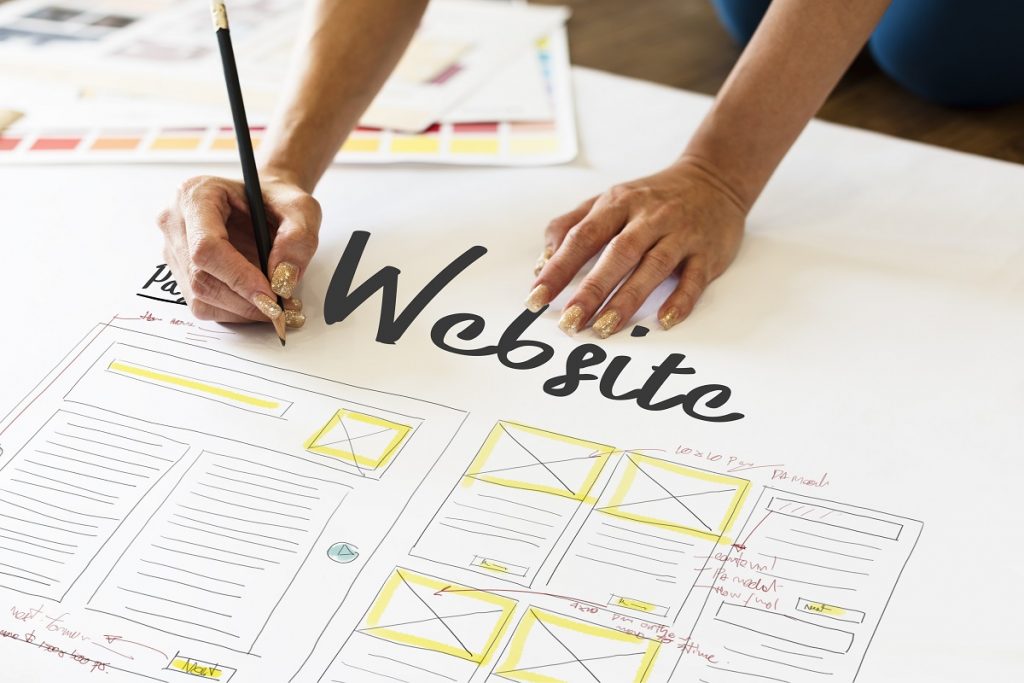
One of the latest website design trends that have proven profitable for Provo clients is the incorporation of graphic design elements into web design. The visual design elements used not only affect the appearance of your website but also its functions. Here are some tips for the incorporation of these elements:
Lines
In graphic design, a line is used to direct, organize, create a rhythm, or express something. Lines have been a primary design element in websites for ages. Nowadays, lines are used to complement a minimalist web design. They will draw your visitors’ attention to different aspects and create various visual effects. The minimalist style generally uses a few solid lines to avoid overpowering the other elements on web pages.
Shapes
These are the visible outlines of everything with width and height. Shapes on your websites are basically a combination of many lines. Most modern websites will include squares, rectangles, circles, or triangles to radiate consistency. However, sites that do not feature any photography or videos will incorporate all these shapes for their drawings and illustrations.
Texture
This is the feel and looks of a surface. The incorporation of texture in website design nowadays resembles a solid color background. However, it incorporates different styles, like concrete, natural, fabric, stone, and paper elements, which are subtle in minimalist designs. The incorporation of texture has a different visual effect to your website.
Space
Negative space is a crucial element in modern website designs. It allows your website’s visitors to read your texts easily. Though negative space is sometimes called white space, it is not always white. The space can be filled with any color. The color can be your logo’s dominant one or one that evokes the emotions that you want your brand to be associated with.
Scale

This refers to the size relation of different elements on your website. A scale is essential to create a visual impact or draw your clients’ attention to various features on your site. Elements with a relatively larger size compared to those surrounding them will attract considerable attention.
In the end, web design in the past was a secluded affair. Nowadays, graphic design is intertwined into web design to guarantee handsome returns from online marketing. Fortunately, you do not need to hire two companies to help you handle both aspects. There are companies with expertise in both graphic and website design. This way, you can benefit from the incorporation of the given elements without spending too much. Remember that website design is a continuous process, and a long-term investment is essential.

